Understanding Pyramid Charts and Their Applications
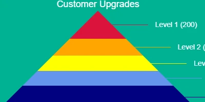
Pyramid charts are powerful visualization tools that showcase data in a hierarchical or proportional format. Typically, they are structured with the largest layers at the bottom, narrowing up to the smallest at the top. This representation is often used to demonstrate how quantities reduce or transform through various stages, categories, or organizational levels. The pyramid chart's ability to depict this hierarchy makes it invaluable for numerous applications across charting, visual status indicators, task management, employee management, and tracking.
Pyramid Charts in Charting and Visual Status Indicators
Pyramid charts efficiently illustrate hierarchical data, providing clarity in data analysis and interpretation. These charts allow users to comprehend complex data sets quickly by visually stacking larger layers at the bottom and smaller ones at the top, demonstrating the proportion or hierarchy visually. This structure is particularly useful for representing different tiers in an organization, sales funnels, or any process with levels that taper off towards completion. These charts serve as effective visual status indicators, simplifying the communication of complex information.
Enhancing Task Management and Employee Tracking
In task management, pyramid charts can organize tasks by their priority or stages. Starting with broader, foundational tasks at the bottom, the chart narrows down to finer details or end-goals at the top. This helps project managers and teams maintain a clear overview of tasks, ensuring that foundational tasks are addressed before the culmination stages. Furthermore, in employee management, pyramid charts illustrate the distribution of roles or personnel across different levels within an organization, highlighting hierarchical structures and helping in tracking progress or resource allocation efficiently.
Integration with Human Resources Processes
Pyramid charts also streamline processes in Human Resources by visualizing organizational structures, career progression paths, or employee distributions across departments. HR professionals can employ these charts to plan and manage workforce structure more effectively, ensuring optimal resource deployment and identifying any gaps or overcrowded hierarchies. By integrating with existing HR processes, pyramid charts assist in strategizing recruitment, promotions, and training needs based on the visual representation of organizational data.
Setting Up Pyramid Charts in SharePoint
Creating a pyramid chart can be straightforward using tools available at
SharePointDashboards.com, where a simple copy-and-paste template enables immediate setup within SharePoint. The process is user-friendly, demanding only a few fields to populate the chart. SharePointDashboards.com provides comprehensive tutorials guiding users through the setup process, making it accessible to those without extensive technical expertise.
SharePoint JSON Formatting
SharePoint facilitates the creation of sophisticated visual tools like pyramid charts through JSON formatting. By applying a template to a SharePoint list view, users can quickly generate visual representations of their data. JSON formatting allows customization of how data is presented, enabling the incorporation of pyramid charts into a SharePoint site seamlessly. This capability ensures that users can leverage existing SharePoint infrastructure for enhanced data visualization without extensive reconfiguration.
Practical Use Case Scenarios
Pyramid charts are adaptable across various domains, providing unique insights and streamlining processes:
- Sales Teams: Use pyramid charts to depict sales processes, showing the number of leads at each stage and clearly delineating where most attrition occurs.
- Project Management: Visualize task dependencies and prioritize actions based on their position within the pyramid. Broad lower layers represent foundational tasks, crucial for project success.
- HR and Recruitment: Display organizational structures to assist in workforce planning and development. For instance, these charts can illustrate employee numbers at different career stages or within different departments, helping in recruitment planning.
- Education: Illustrate educational pathways or program structures, showing the foundation courses at the base and specialized courses at the pinnacle.
Each of these scenarios demonstrates how pyramid charts communicate data structured hierarchically or proportionally, facilitating informed decision-making and strategic planning.
Conclusion
Pyramid charts offer a versatile tool for visualizing hierarchical data, enhancing the clarity and efficacy of data communication in various applications. By integrating these charts into SharePoint using easy templates from SharePointDashboards.com, organizations can efficiently manage and represent their data, bolstering task, project, employee, and organizational management processes. As data visualization continues to play a critical role in decision-making, pyramid charts will remain an invaluable asset for professionals seeking to distill complex data into an easily digestible format.