The Power of Funnel Charts: Visualize Your Data with Precision
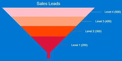
In the world of data visualization and project management, funnel charts have emerged as a critical tool for understanding sequential processes and identifying points of attrition. These charts, designed to illustrate a progressive reduction through a series of stages, offer a vivid representation of how items or tasks move through a pipeline and where drop-offs occur. This method of data depiction is especially useful in scenarios like sales pipelines, where stages such as New Leads, Qualified Leads, Proposal Sent, Negotiation, and Closed Deals narrow successively, creating the distinctive "funnel" shape. The effectiveness of funnel charts is amplified when integrated into systems like SharePoint, which offers accessibility and flexibility.
Funnel Charts in Charting and Visual Status Indicators
Funnel charts serve as an excellent tool for charting and visual status indicators. By structuring data into a funnel chart, organizations can easily track the progression and reduction of items or tasks as they move through phases. In a typical sales pipeline, for example, you witness a decreasing number of items as potential deals move through the stages from introduction to closure. This visual allows stakeholders to quickly pinpoint areas where improvements are necessary, such as the transition stage where the number of Qualified Leads significantly drops before reaching Negatiation.
Enhancing Task and Employee Management
When applied to task and employee management, funnel charts provide meaningful insights into workforce allocation and task completion rates. This visual tool can highlight stages where tasks stack up and assess whether bottlenecks are due to resource allocation, procedural inefficiencies, or other factors. Employers can leverage this insight to optimize employee management and reallocate resources where needed. By visualizing the workflow in a funnel chart, managers can better oversee task progression and employee performance, ultimately enhancing productivity and operational efficiency.
Integrating Funnel Charts with HR Processes
Human Resources departments can also greatly benefit from the application of funnel charts. In recruitment, for instance, HR professionals can map out a funnel chart that visually represents the recruitment process. Starting from the application stage, progressing to interviews, and finally to hiring, the chart helps HR teams understand at which stages candidates fall off. This enables them to identify and rectify potential hurdles in their recruitment strategy. The funnel chart becomes a strategic tool for enhancing recruitment efficiency by showing where the process may need adjustment.
Setting Up Funnel Charts in SharePoint
Implementing funnel charts in SharePoint has become a streamlined process, thanks to resources like SharePointDashboards.com. By utilizing the Funnel Chart Template available on this platform, users can easily create compelling visuals with minimal setup. The beauty of using SharePoint for this purpose lies in its ease of integration and the ability to share these charts organization-wide without additional costs, a notable advantage over alternative tools like Power BI. The Funnel Chart Template offers customization options to control colors, text, and dimensions, ensuring that each chart fits the organization's needs precisely. For those new to the platform, SharePointDashboards.com provides access to 21 free templates upon registration, making it accessible to a broader audience.
Understanding SharePoint JSON Formatting
To further enhance the utility of funnel charts, SharePoint allows users to apply advanced JSON formatting to list views. JSON, or JavaScript Object Notation, is a lightweight data interchange format that enables customization of SharePoint lists, including altering the appearance of columns and rows to suit specific visual needs. Applying a funnel chart template to a SharePoint list view provides a clean and intuitive interface for data representation. This is achieved through a simple copy-and-paste method, allowing users to switch between standard lists and more visually engaging formats without extensive coding knowledge.
Use Case Scenarios for Funnel Charts
To fully appreciate the versatility of funnel charts, consider several potential use cases:
- **Sales Processes**: Companies can map their sales pipeline stages using funnel charts to quickly assess where drop-offs occur and focus efforts on improving conversion rates.
- **Project Management**: Project managers can visualize task completion rates across different phases of a project, highlighting areas of concern where tasks may be stalled.
- **Recruitment Tracking**: HR teams can use funnel charts to illustrate application progress through various recruitment stages, identifying drop-off points to improve hiring strategies.
- **Customer Support**: Customer service departments can depict the complaint resolution process, from ticket opening to closure, helping identify inefficiencies in addressing customer issues.
In each of these scenarios, the funnel chart acts not only as a monitoring tool but also as a strategic instrument for ongoing process improvement. This emphasizes its role in driving better business outcomes through enhanced data visibility.
By leveraging the power of SharePoint combined with the straightforward utility of funnel charts, organizations can revolutionize their approach to data visualization. This not only supports better decision-making but also fosters a culture of transparency and accountability where everyone is aligned with organizational goals.